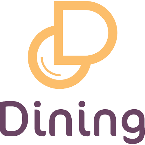
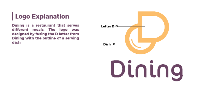
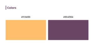
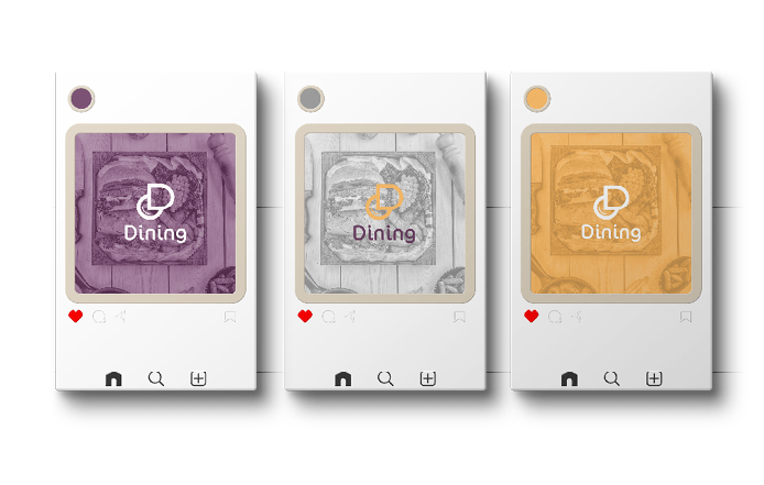
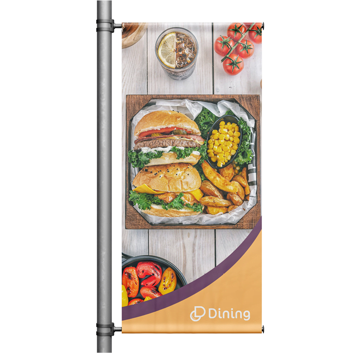
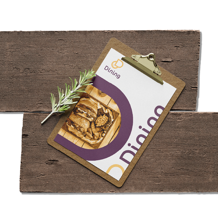
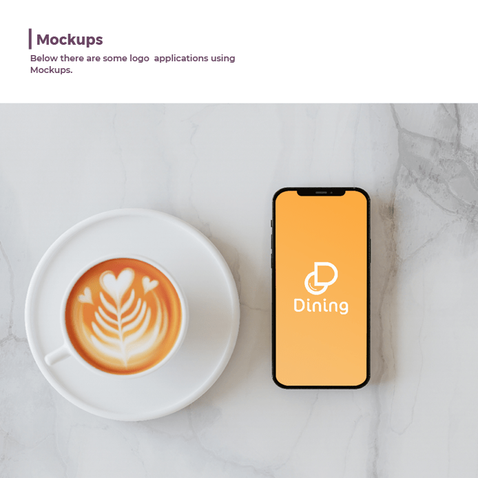
This logo makes the restaurant stand out and distinguishes it from others. We focused on creating a simple yet effective design, utilizing a round bowl shape overlapping with the letter D. We also took into consideration consistency in weights between the letter and the shape. Both elements are in yellow to attract attention, as it suggests joy, warmth, and fun, elevating the business outlook and leaving an everlasting impression. Additionally, a secondary color of purple was chosen to complement the design.