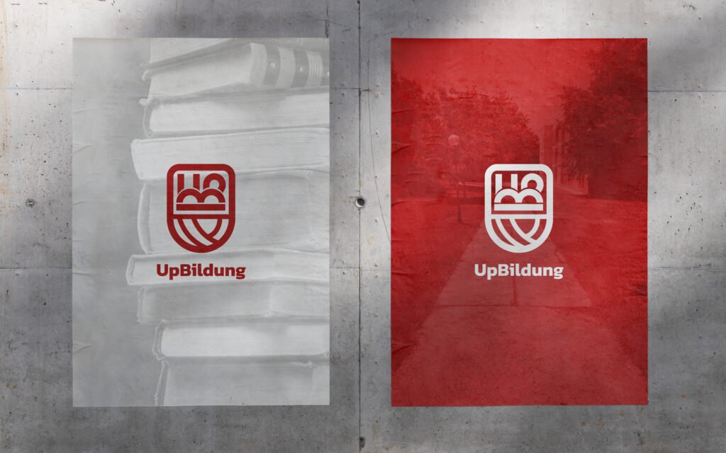
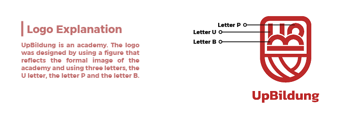
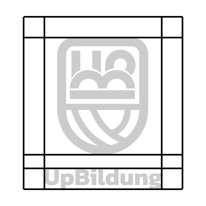
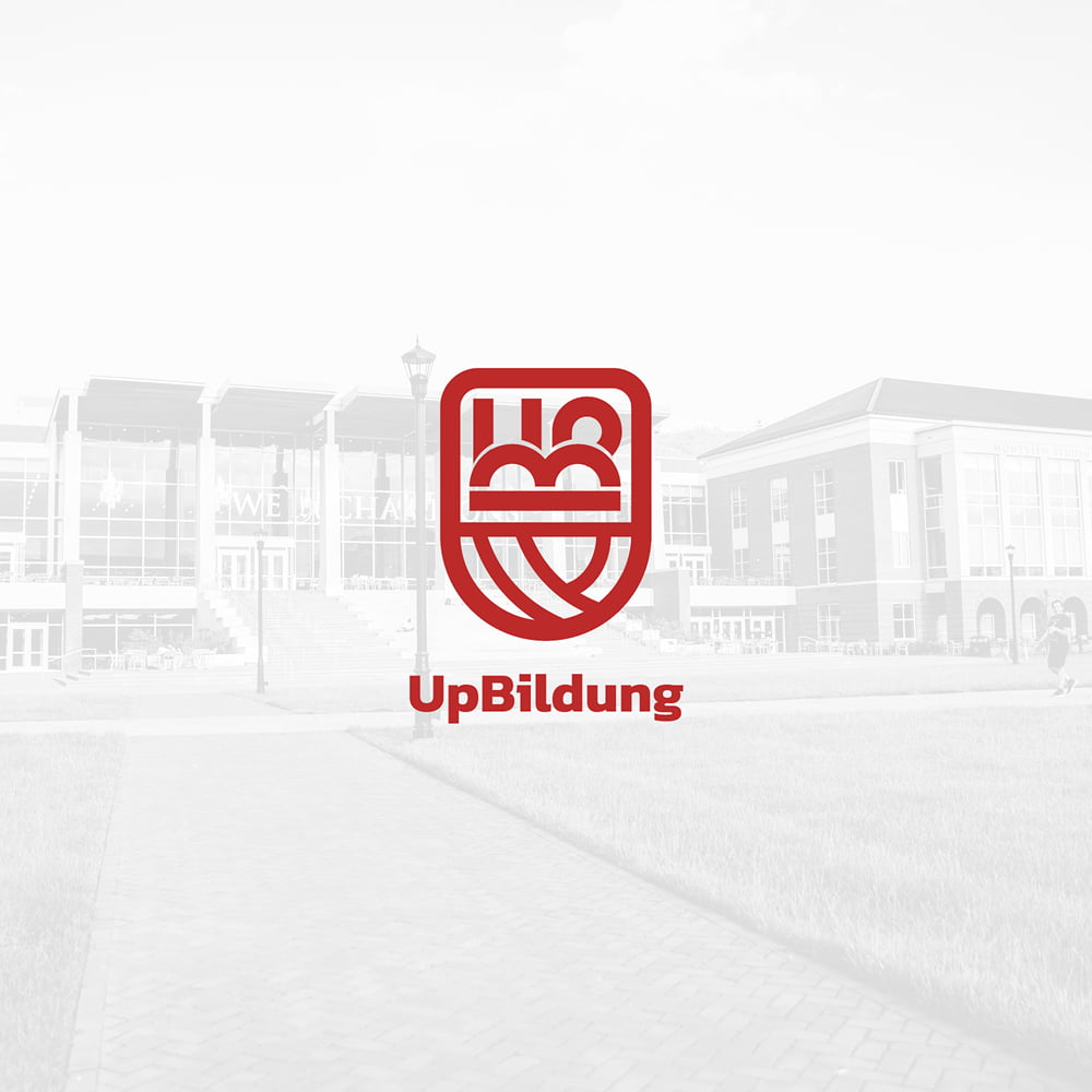
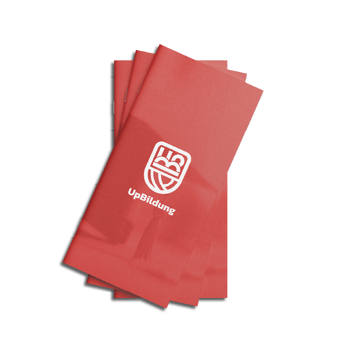
UP.Bildung is a licensed school approved by the German Ministry of Education. It operates three branches in Weimar, Jena, and Gera, offering education across all academic stages from kindergarten to high school. The school’s vision is to create a society that is academically and culturally enriched, positively impacting the lives of many. This vision is realized through the academic achievements of its students and their exploration of new opportunities. UP.Bildung is also known for selecting an educational board of high competence and caliber.