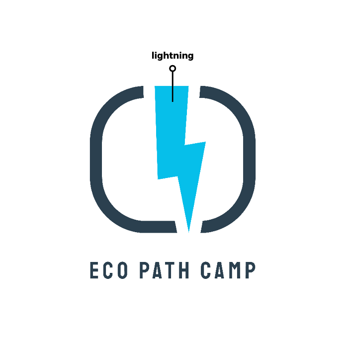
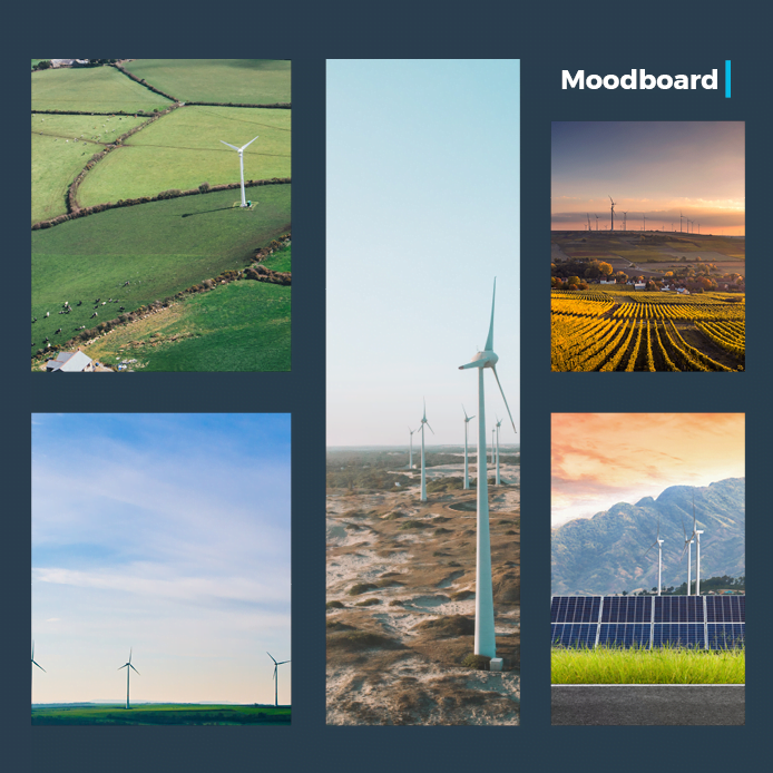
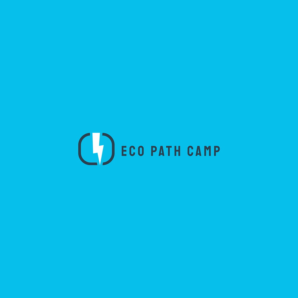
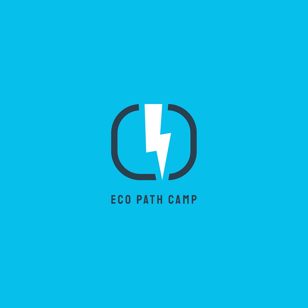
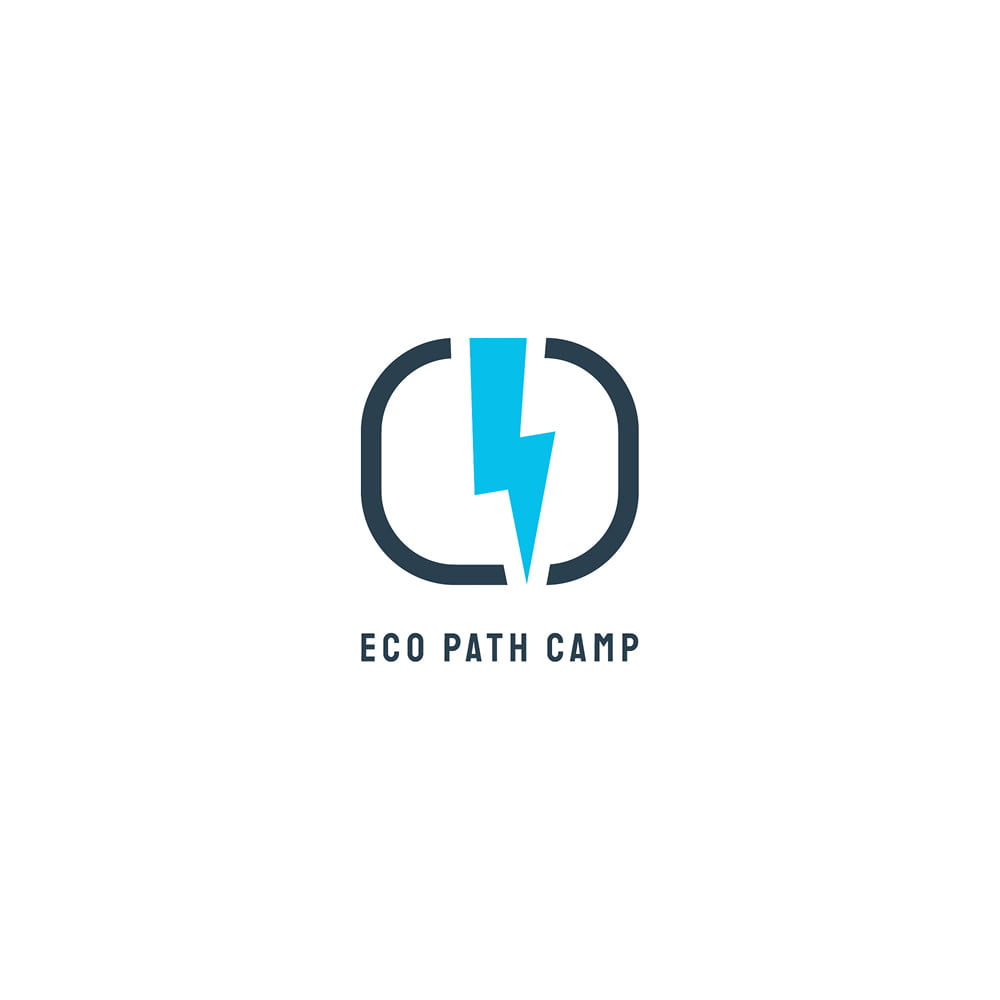
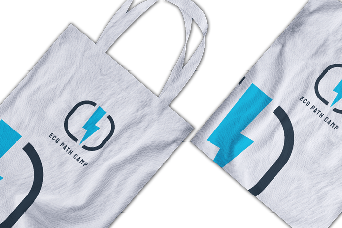
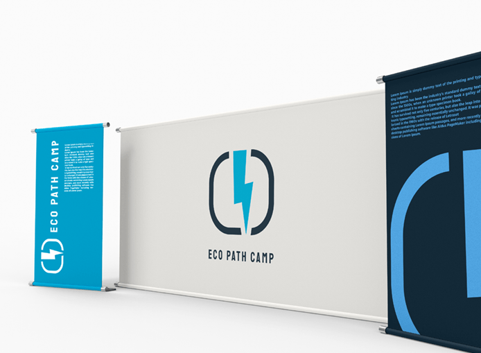
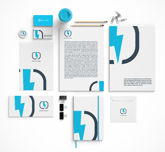
EcoPath Camp represents a clean energy production company that aligns with the principles of ecology and sustainability. The logo design incorporates simple yet meaningful shapes along with other elements to create depth and uniqueness. The central element is a lightning shape, symbolizing energy. Initially, a frame representing a trajectory was considered, but it lost its essence when combined with the letters “E” and “C.” Therefore, the idea was abandoned, and only the track shape was used, intersecting with the lightning shape to unify the negative space. The blue color was chosen as a balance between energy and ecological sustainability.