About
Solarize Pip
Solarize Pip specializes in manufacturing highly advanced solar panels, known as solar energy units, that are among the most advanced in the world. The company provides solar system installers, integrators, and vendors with advanced technical filters to help them find the PV panels that best suit their specific needs. The panels offered by Solarize Pip have several distinguishing features, including high efficiency, durability, and a range of power options.
Logo Concept


Designing Brief
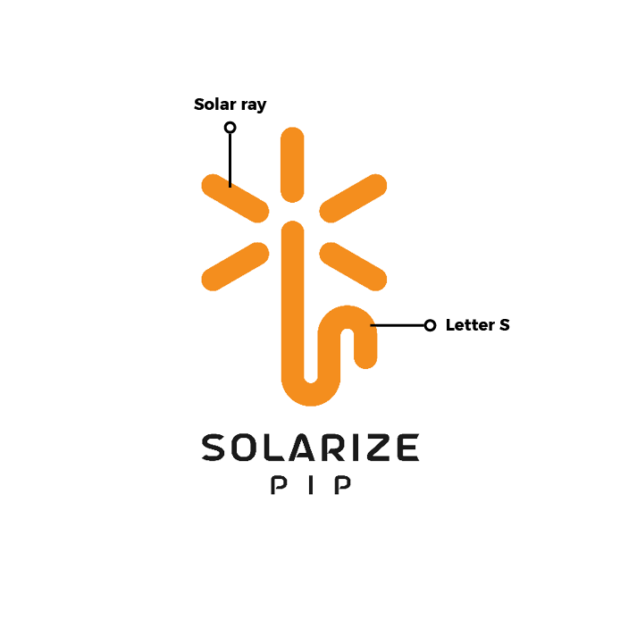
The logo for Solarize Pip is inspired by the concept of transformation and the utilization of solar power. The design incorporates an inverted “S” letter, symbolizing change and a shift in direction. This dynamic shape represents mobility and high quality. The overall shape of the logo resembles a solar ray, highlighting the focus on solar energy. The yellow color used in the logo symbolizes the sun, emphasizing the connection to solar power.
Final Result


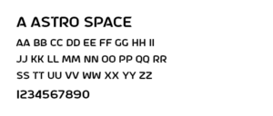
Typography
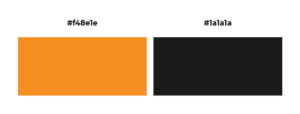
Color Palette
Logo Applications
