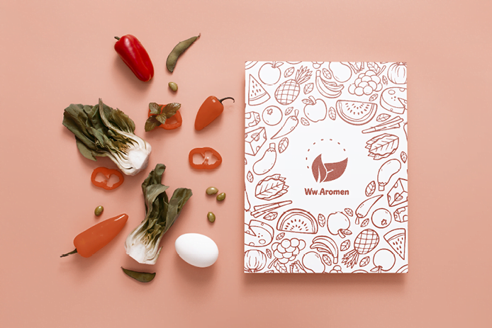
Ww.Aromen is an international restaurant that brings together flavors from all over the world. It offers a wonderful opportunity for individuals passionate about discovering new cultures, especially those who haven’t had the chance to travel or explore different countries. The restaurant provides guests with the opportunity to try delicious and unique dishes from various continents, including Arabic, Asian, and European cuisines. The main goal is to satisfy all tastes by employing a staff of professional cooks from 30 different nationalities. There are plans to expand and open new branches in Switzerland, specifically in Schwyz.